A new year, a new font
I spent the year-end holidays resolving my dilemma of switching to a new font for my website. The process of changing the base font took much longer than I anticipated. Despite my best efforts to make the design of this site flexible and agnostic to font changes, there were nonetheless changes required to accomodate new formatting features. Preparing all variants of the fonts, testing their rendering and features, all take time.
The body text and headings on this site are now typeset in Source Serif Pro.[1] I’ve made the switch from Bitstream Charter. As pictured below, they’re both beautiful screen fonts.
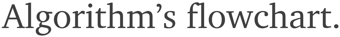
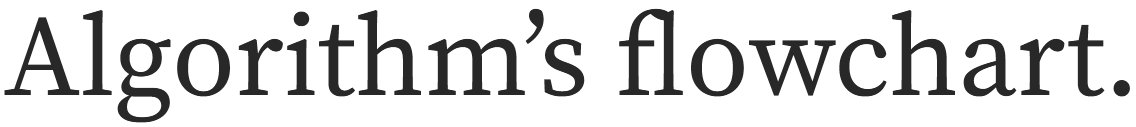
There’s nothing inherently wrong with Charter. In fact, it’s still the better looking font in my opinion with slightly narrower glyphs and a bit wider word spacing. So why exactly did I switch from Charter?
Goodbye Charter
Charter was designed by Matthew Carter in 1987 for Bitstream Inc.[2] Bitstream donated a version of Charter to the X Consortium under a very liberal license. Despite its age, Charter still renders beautifully in today’s high-resolution screens but it somehow hasn’t become more popular. Among freely available serif fonts suitable for body text, I believe Charter is by far the best looking one.
One of the issues with Charter is that it has a limited character set. There’s a similar font called Charis SIL, which has an extended character set and seems to be supported by SIL. But somehow I wasn’t satisfied with the way it rendered on screen. I’m not sure if it was due to the hinting or was the shape of the glyphs themselves and I ended up passing on it.
However, my main issue with Charter is that it doesn’t include small caps. Small caps (small capitals) are shorter versions of regular capitals. Small caps go well with lowercase letters and offer a subtler alternate to bold or italic for emphasizing text. However, word-processors and browsers are notorious for generating fake small caps when small-cap formatting is enabled and often end up looking dreadful. Real small caps are made by the font designer themselves and included as part of the font or offered as a separate font. Small caps are wonderful typographic elements but quite underused in web typography. Understandably so since most free fonts don’t include small caps and fallback handling for older browsers is rather tricky.
I recently discovered a LaTeX font package called xCharter. It’s an extended version of Bitstream Charter with support for more languages and includes small caps, old-style numerals and superior figures in all four styles. It also comes under a free, liberal license. Perfect! This has to be the best free version of Charter to use. But xCharter is a LaTeX font, so isn’t readily available as a webfont. But after convert its OTF files to their WOFF versions, I noticed a slight kerning issue. The kerning between the uppercase “F” and lower case “a” was too narrow. I couldn’t get over how weird the word “Facebook” looked every time I saw it my previous article. Luckily, this was a minor issue which I resolved by editing the kerning table, increasing the spacing and re-generating the files. But I noticed a more serious problem. One which turned out to be a deal breaker for me and would require too much time and effort to fix. The small caps of xCharter when combined with regular capital letters didn’t gel well. Perhaps it’s an issue with the webfont or something went wrong with the conversion. Perhaps it had to do with my particular combination of browser and operating system. I assume it looks perfectly fine when used with LaTeX to generate PDFs. Regardless, I couldn’t justify switching to a font whose small caps weren’t to my liking, when the lack of small caps was the main reason I wanted to switch fonts in the first place.
If you’re considering using Charter for your website, you should. It’s the best looking free serif font for body text in my opinion. The xCharter version of it would be the way to go especially if you don’t plan on using regular capitals with small caps. But if you’re looking for the complete version of Charter, consider licensing ITC Charter. It’s the real deal.
Exploring other fonts
I experimented with many fonts including Amiri, Alegreya, Crimson Pro, Crimson Text, Vollkorn, PT Serif, Lora, Slabo, Spectral, Libre Baskerville and dozens more. Some of them (like Crimson Pro) came close to my needs but ultimately fell short one way or another. Either they didn’t have what I considered necessary ligatures, were too brittle, too wide, too dark or simply didn’t suit my taste in serifs.
There are millions of commercial fonts but the most of them have cumbersome licensing terms for usage on the web. While licensing a commercial font may be beneficial from a typographic perspective, I need to consider my return on investment. I make no money from this website and I’m doing it purely as a hobby. An expensive hobby that involves paying for the domain name and hosting. Thus, I’m trying to be careful with how much I devote to this hobby in terms of both time and money. There are a few fonts that are offered under pay-once, no-nonsense licenses but I’ll discuss these some other time. For the time being, especially given my recent purchase of an iPad and an Apple Pencil, I curbed my temptation to invest in a commercial font.
Enter Source Serif Pro
Source Serif Pro is a traditional serif created by Frank Grießhammer for Adobe Inc. It’s an open source font that’s licensed under the SIL Open Font License, version 1.1. While it’s been on my radar since the very beginning of starting this site, I personally like taller, slightly narrower typefaces for on-screen body text. And in this regard, I find Charter to be the better looking of the two and why I had initially chosen it.
-
It’s relatively modern and well supported by Adobe. While I don’t expect major updates, it’s good to know there’s some support behind it. For instance, it’s already available as a variable webfont.
-
It’s available in 6 different weights (extra light, light, regular, semibold, bold and black) as opposed to Charter’s 2 (regular and bold). While I don’t plan on using all weights, it’s nonetheless useful to have the option of using them in the future.
-
It has small caps and alternate numerals (old-style, proportional and tabular) baked into the font. They can activated using
font-feature-settingsorfont-variantCSS properties rather than loading them as separate font files. -
It covers a wider character range with full subscript and superscript; currency symbols like the Euro, Rupee, Ruble, Lira; special symbols like the copyleft sign, slashed zero; geometric symbols like triangles, arrows, fisheye, lozenge and many more.
-
Its italics are on par if not better than Charter’s. Frank Grießhammer, after consulting with Robert Slimbach, decided to hold back the italics from the initial release of Source Serif Pro. The italics were refined and published later.[3]
-
It works for both body text and headings. I wouldn’t consider using Charter for headings and had to use Fira Sans instead. Interestingly, I find headings typeset in Georgia look better than Charter.
Source Serif Pro comes in OTF and TTF formats. The major difference between the formats is their hinting. The OTF based WOFF/2 renders noticeably darker. For this reason, I opted to go with the TTF based WOFF/2 version.
I’m overall pleased with the results so far. I haven’t had to resort to modifying Source Serif Pro yet. Hmm, I wonder if I should try my hand at designing some fleurons[4] for Source Serif Pro…