Switching to a flexbox layout
Building a website involves a series of decisions that impact its form and function. Even static sites need deliberation in their design to further their potential. Having clear design goals help but they are seldom future proof.
-
Easy to build, test and deploy.
-
Require minimal maintenance.
-
Use well-established standards and open-source tools.
-
Have a clean design which puts the focus on the content.
-
Must work well on mobile, tablets and desktops.
-
Support old browser versions as far as possible.
Supporting older browsers became a goal because
I have an old iPad (with Safari 5) that can no longer be updated.
I use it occasionally to browse the web
and it irks me when sites don’t render properly.
Even more so when it’s a damn simple site such as this one.
It’s merely a bunch of static pages.
Surely, there’s no justification for it to be disfunctional on old browsers, right!?
Unfortunately, the world isn’t so simple.
The older the browser,
the more it’s riddled with bugs
and the more obscure the hacks required
to bend them to one’s will.
It’s futile to attempt to build a site that’s compatibile with every browser version ever released.
Nonetheless, I wanted to try to make this site work on this old iPad.
This stemmed my decision to use the old display: float rather than flexbox.
Float based layout
I’ve styled this site using a float based layout since its inception.
My intention was to make this site compatible with old browsers.
A float based layout uses display: float to position elements on the screen.
It doesn’t offer the most control
but it’s guaranteed to be supported by old browsers.
It seemed to work reasonably well until I started discovering issues with the footer.
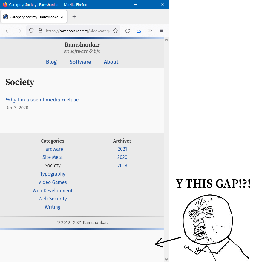
When the contents of the page was too short, the footer/sidebar wasn’t pushed to the bottom of the window, as illustrated in the screenshot above.
-
If the contents of the page is too short, the footer must stick to the bottom of the browser window.
-
If the contents of the page exceeds the browser window’s height, the footer must get pushed below the content.
-
The above two rules must not assume a fixed sized footer.
This sticky footer must not be confused with the position: sticky or display: fixed properties.
These don’t seem to cut it for our requirements.
To work around this problem with the sticky footer, I added arbitrary padding to push the content past the window’s height. This was an ugly hack at best and not a proper solution. After much cursing and experimentation, I’ve found two solutions that address this issue. One uses the relatively modern layout using Flexbox. And the other — probably as old as HTML 4.0 itself — uses tables.
Table based layout
Tables were designed for displaying tabular data. Although they can be used to layout elements on a page, it’s not what they were meant to do.
| Using tables for layout isn’t semantically correct. It may also break certain screen readers. Unless there’s a specific reason to use tables for layout (such as supporting very old browsers), flexbox or grid should be used instead. |
Throwing caution to the wind,
I tried implementing a sticky footer using a table based layout.
This requires div wrapped around major elements for padding to work,
but luckily that’s not too difficult.
I had to restructure my HTML as follows:
<body>
  <div class="content-wrapper">
    <header></header>
    <main></main>
  </div>
  <div class="footer-wrapper">
    <footer></footer>
  </div>
</body>
What was required next was to style the elements as follows:
body {
  display: table;
  width: 100%;
  min-height: 100%;
}
.content-wrapper {
  display: table-row-group;
}
.footer-wrapper {
  display: table-footer-group;
}
The above solution worked fine on Microsoft Edge and Google Chrome.
However, there were more hacks required for Firefox.
Specifying height: 100% in neither the body nor html was sufficient to convince
Firefox to push the footer to the bottom.
I had to use height: 100vh in the body class
in combination with display: table-cell and vertical-align: bottom instead of display: table-footer-group.
This made Firefox and the other browsers happy.
Yay? I guess!?
Not exactly.
Using modern viewport units (vh) defeats the purpose of using tables for backwards compatibility.
A browser that doesn’t support flexbox is unlikely to support viewport height units.
Anyway, here’s how the CSS looked:
body {
  display: table;
  width: 100%;
  min-height: 100vh;
}
.content-wrapper {
  display: table-row-group;
}
.footer-wrapper {
  display: table-cell;
  vertical-align: bottom;
}
This is not an ideal solution which once again reinforces the fact that tables were never meant for layout. They should only be used as a last resort fallback. For the sake of my sanity, I decided this was good enough. I then moved along to implementing the layout using flexbox.
Update 2021-11-18:
I came across a solution from Silvio Rosa that does not need tables.
I’ve altered it to avoid viewport units (as it’s not supported by older browsers) and use percentage instead.
I’ve also specified the height and min-height in the html and body selectors respectively.
The altered solution is given below.
|
html {
  height: 100%;
}
body {
  min-height: 100%;
}
.footer-wrapper {
  position: sticky;
  top: 100%;
}
This technique is much more elegant than using tables for layout,
however position: sticky is not as old as I thought.
In fact, it’s not supported by Safari 5 at all.
But upon testing my table-based solution on Safari 5,
that too doesn’t work as intended.
Perhaps, Safari 5 as a browser is broken beyond redemption.
Anyway, pick one of these solutions for backwards compatibility as you see fit.
Old browsers are way too buggy for me to bother caring beyond this point.
I moved on to using flexbox for layout when it’s available.
Flexbox based layout
Flexbox is the preferred approaches to placing elements in a page. An even newer technique is using grid but obviously not as backwards compatible. For this reason, I ruled out using grid. Flexbox is widely supported by most browsers for a few years now. It’s not particularly new, but since I was prioritizing backwards compatibility I hadn’t used it thus far.
Using media queries I was able detect flexbox support and switch to it. The HTML is identical to what I used above for the table layout. But adapting the CSS as follows gave a perfectly working sticky footer behavior across all browsers.
body {
  display: flex;
  flex-direction: column;
  height: 100%;
}
.content-wrapper {
  display: block;
  flex: 1 0 auto;
}
.footer-wrapper {
  display: block;
  flex-shrink: 0;
}
Short, sweet and elegant! Flexbox with sufficient browser-specific prefixes gives decent coverage. However, flexbox is not without its fair share of bugs. I’ve worked around a couple of the most important ones, but I can’t be bothered with all of them. I’ve spent enough time on this nonsense.
Sidebar versus Content
As part of the redesign and my exploration of dirty CSS compatibility, I pruned the sidebar and merged it into the footer. A sidebar helps users with navigation and discoverability. For most sites, driving traffic to as many pages as possible is important. For this site, I want the content to be the prime focus. I’m not very concerned with driving traffic to other pages or promoting other content. The sidebar made the most sense in the software section of this site, where it had links to screenshots, downloads etc. but not so much in the blog which had only links to archives and topics.
Conclusion
This was one of those instances where despite spending a lot of time tweaking, experimenting and researching on some obscure crap, I didn’t feel like I learnt anything new. Just re-affirmed myself that fiddling with buggy browsers and horrible standards is not really worth it. Preserve your sanity — use flexbox or grid.